Risk vs. Reward: Bringing Your Fund’s True Value to Life

April 24, 2026

How do you make a fund that looks slower on paper feel like the smarter choice?
A fund trails its peers on headline performance. Investors switch off; the numbers close the conversation before the fund’s strategy has a chance to speak.
Is it a lost cause?
From: A Sole NAV Lens
Assessed on annualised net asset value (NAV) performance alone, GoodDD Equity Fund appears less competitive than its peer group. Suffice to say, the comparison is unflattering for investors anchored to raw returns.
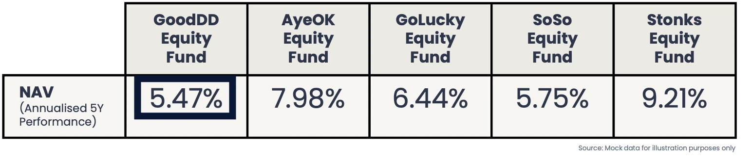
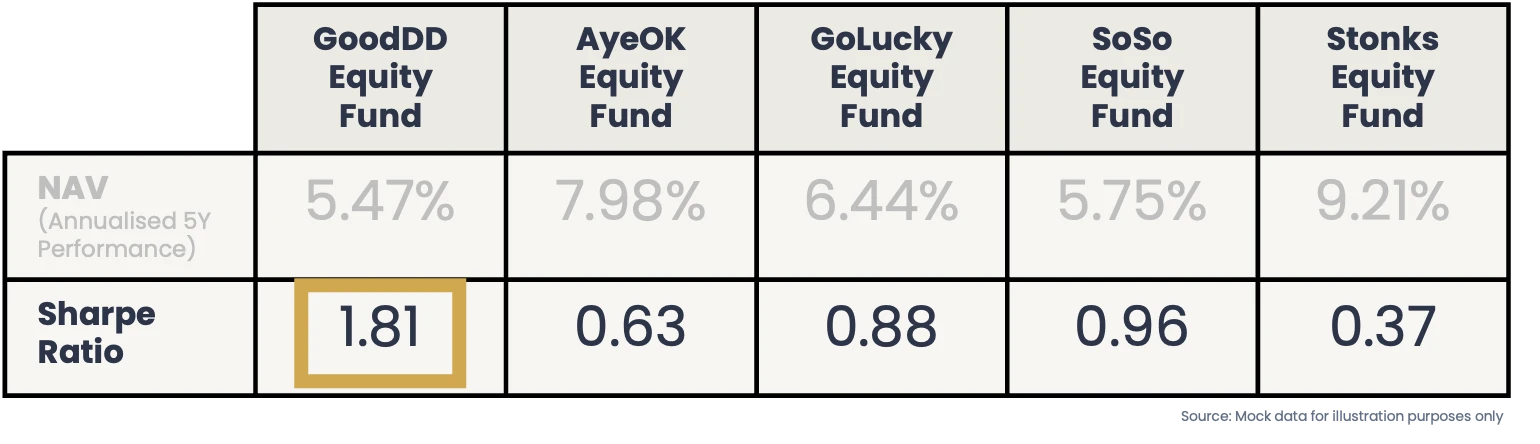
To: Weighing Return per Unit of Risk
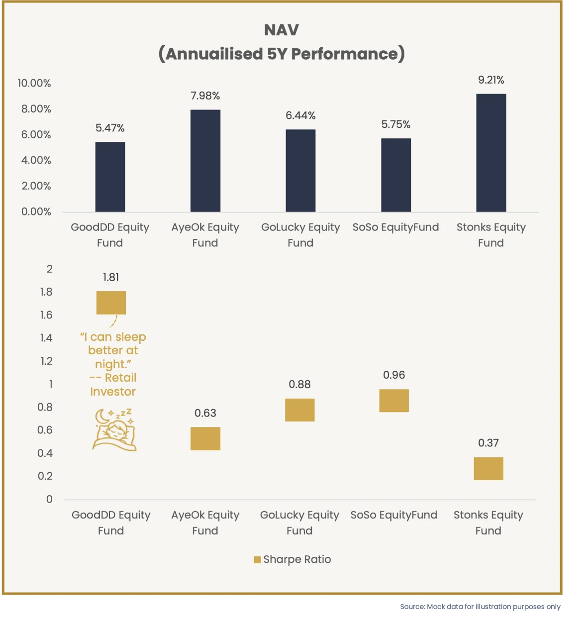
Shift the lens from return to return per unit of risk, and a different fund emerges entirely.
Because the Sharpe ratio measures how much return a fund generates for every unit of risk it takes on, a higher ratio means smarter, delivering returns with less volatility, less exposure, and less of the downside risk that quietly erodes wealth in turbulent markets.
The Communication Imperative
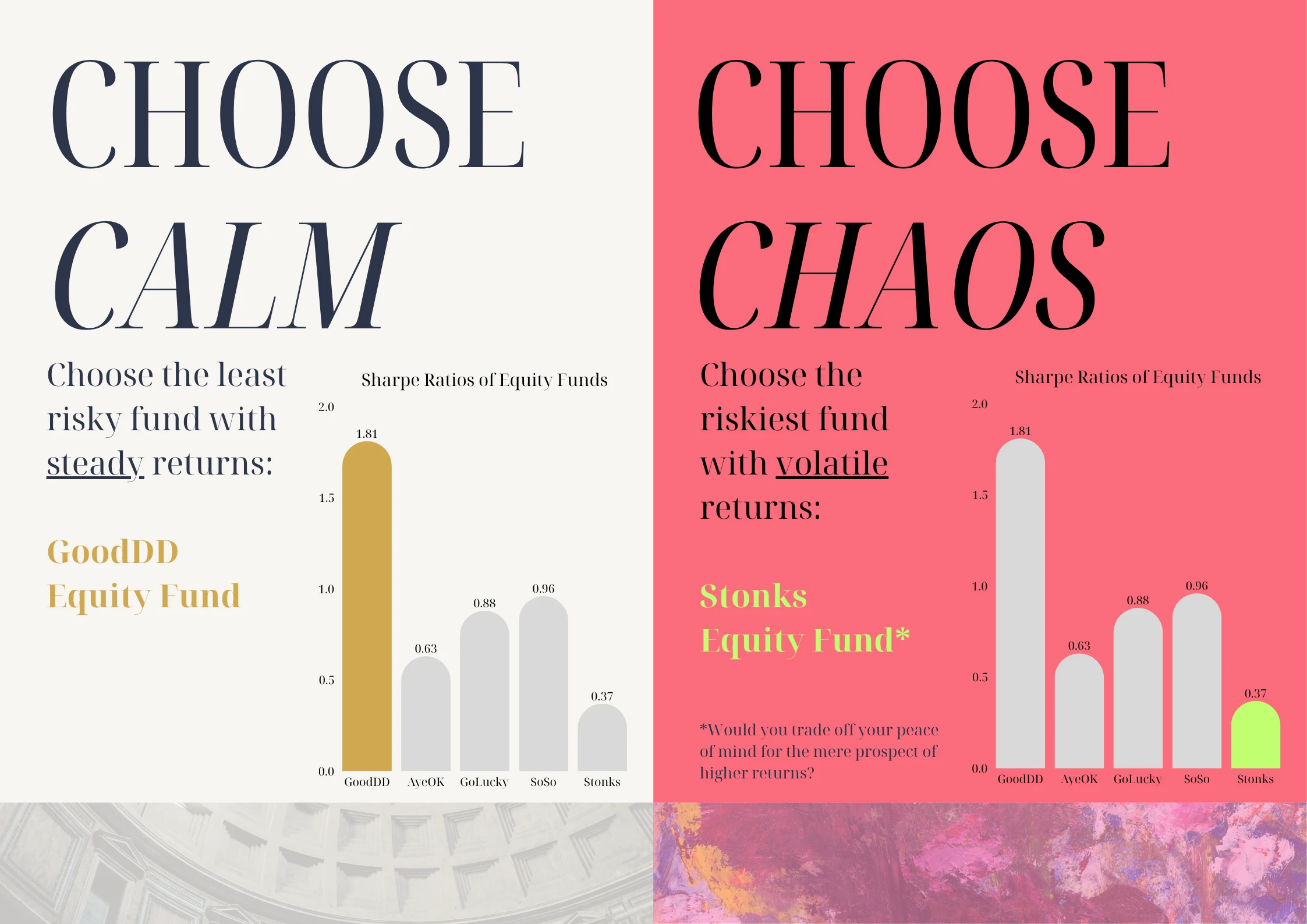
And so, through the conservative retail investor’s point of view, the right question then pivots from “which fund grew the most?” to ”which fund can I trust to still be here, intact, when I need to cash out?”
Engagement and Creative Interpretation
The gap between the safest and the most aggressive fund in a peer group can be the most instructive data point. Placed side by side, a creative comparison on risk-adjusted performance makes the principle land with conviction.
+++